
Role
Product Designer
Scope
As the sole designer at the time, I designed a full fledged app simplifying modern home management for busy lives.
Timeline
Oct 2022 - Apr 2023
A home management app to track, declutter, and source contractors for everyday needs without having to change your workflow
Overview:
eeva’s team approached me with a clear challenge: how can we simplify home management and reduce the burden of daily tasks for busy individuals and families? With the demands of modern life pulling people in multiple directions, managing a home efficiently often feels overwhelming (let alone unexciting for a lot of us). So we set out to build the exact opposite - a home management app designed with a seamless, intuitive experience that empowers users to stay organized without the mental load. eeva’s goal is to streamline home management, allowing users to spend less time on chores and more time on what truly matters.
Current Situation:
An endless journey of unavoidable tasks
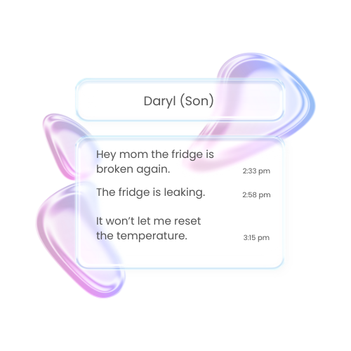
Overwhelmed by responsibilities, underprepared for solutions. Many individuals and families find themselves sidetracked by household chores without even realizing it—what starts as a quick task often extends into hours of unplanned work.

Who are we referring to?
On average, women spend about 2.7 hours per day on household activities, while men spend approximately 2.1 hours. Without a consistent system to manage these tasks, people become reactive rather than proactive, constantly playing catch-up instead of adhering to their schedules. This imbalance not only disrupts personal routines but also contributes to stress and reduced well-being. The result? Less time for work, rest, and the activities that truly matter.
American Time Survey 2023
Zhao, X., Wu, H., & Luo, H. (2020). The impact of household chores on family well-being: Evidence from a cross-national survey.
Unmet needs:
Finding desires within painpoints
It was clear that individuals and families were constantly sidetracked by home activities, but I needed to understand how we could better help them navigate through their daily routine to reduce the workload. To support their needs, remote video interviews were conducted and synthesized into personas so I could gauge into the desires of prospective home management app users.


Parents—Families
FT workers, fixed schedules
Roles are assigned in households
Trouble managing multiple properties
Overwhelmed with tasks and lacks time management for the whole family

Single—Roommate/Partner
Seeks help from parents, cleaners, landlords
Procrastinates tasks
No central system in the household, roommates work on own terms
Long communication process sets out delays for repairs and management
Lack of control
Centralize communication and organization for the modern home by building easy tracking, documenting and communicating services that is transferable across multi platforms.
Opportunity and Goal
Visual Identity
Reflecting on user needs:
Designing clarity within expression
eeva’s branding curation started with our goals. The brand look and feel should demonstrate ease and simplicity throughout while being playful and unconventional to foster a seamless flow. The focus on visuals were significant since current experience from the user research presented a lack of organization and proper tools.


User testing and wire framing:
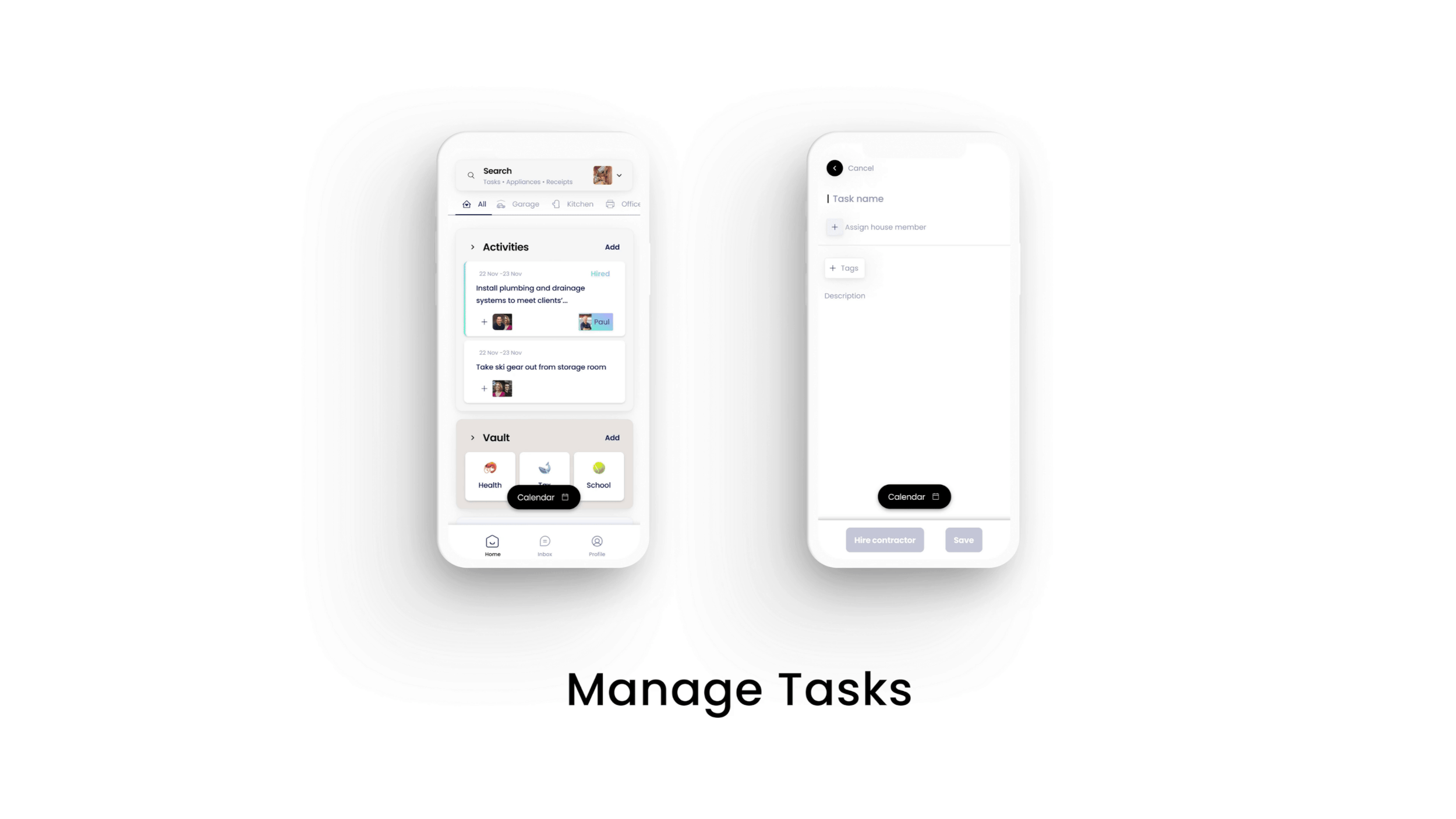
Designing productivity from the ground up
During the first iterations, eeva’s home space, activity, vault, and task setup faced mixed concerns within the team. To prepare for the app’s initial release and pre-seed funding, I conducted user research to gather feedback and implemented existing brand guidelines to ensure simplicity and consistency in the design.
The initial home screens were divided in two views from tasks to members which then subcategorized into smaller groups. Although this tackled the filing of tasks, there was a lot of overwhelming content and ease of navigation was not in place. Keeping the initial feedback in consideration, I revised the home screen to single view to simplify the flow, but found ease of navigation was not satisfactory still.
In creating the new home screen, the team wanted to visualize an activity flow which we aimed to design a structure that achieved two key objectives: (a) streamlining and accelerating the task workflow, and (b) providing clear, concise information paired with actionable insights for an enhanced user experience.
Prioritize: I regrouped search and navigation bar functions for increased usability
Consistent: Working with the previous design layout and given information the designs were only simplified to reflect more clarity in the app
The vault’s initial design aimed to organize user data securely but lacked clarity in navigation. Early iterations focused on refining the UI to enhance usability, while structural changes were implemented in the final stages to ensure intuitive access and alignment with eeva’s goal of effortless data management.
The vault was refined from its initial concept to prioritize intuitive navigation and secure organization of user data. By simplifying the structure and applying consistent design elements, I ensured that the vault aligned with eeva’s goal of effortless home management.
Usability: To improve efficiency and reduce user frustration, Face IDs have been removed for a friendlier flow
Actionability: No incomplete user actions or misleading icons. If users access their vault they should be able to easily recognize, edit, exit and add to their files
Streamlining and expanding flows for business scalability:
Contractor Marketplace and Property Management
Creating an app for users to easily access and engage with all types of resources and opportunities within their home needs was ultimately the design goal. Layouts were designed with scalability in mind for product shipping and future iterations.
The contractor marketplace is a vital addition to eeva’s platform, designed to complement task activity and enhance user satisfaction. This feature was introduced to expand eeva’s functionality by integrating third-party services, offering users a seamless and enriched experience.
The property management feature was designed to help users efficiently handle tasks and responsibilities for their properties. Initially inspired by Airbnb, the design has been reimagined to reflect eeva’s core principles of simplicity, usability, and seamless integration.
Functionality: To improve efficiency and reduce user frustration, search bars and property context has been reinstated to reflect the needs of the user
Design Hierarchy: To reduce unnecessary space and improve workflows, images, shadows, and CTAs have been resized to boost efficiency
Branding and UI Library:
Contractor Marketplace and Property Management
Results:
Turning challenges into innovation
After months of product development and pivots, we secured $100K in funding and earned second place in the McGill Dobson Centre for Entrepreneurship Pitch Competition. Along the way, we faced challenges like feature overload, misaligned user flows, and failed ideas such as overly complex collaboration tools, all of which were redesigned to create a more user-focused solution.